


How it works
Motion Section is a section whose top and bottom edges bend with the speed of the scroll, then spring back to flat. Drop any element into the Content slot. Match the edge color to the background of the section next to it.
Tag
HTML tag: the semantic tag of the section. Default is section.
Custom tag: shown when HTML tag is set to custom.
Edge
Color: fill of the edge. Default is #ffffff. It is written to –ne-motion-section-edge.
Height: height of the edge. Default is 150px.
Position: Top & Bottom, Bottom, or Top. Default is Top & Bottom.
Animation
Velocity threshold: how fast the scroll has to be before the edge starts to bend. Default is 200.
Velocity max: the scroll speed that bends the edge as far as Bend allows. Default is 2000.
Bend: how far the edge dips or rises from the flat line. Default is 10.
Morph duration: how quickly the edge follows the scroll speed, in seconds. Default is 0.1.
Spring duration: how long the edge takes to spring back, in seconds. Default is 0.5.
Spring: how strong that spring is. Default is 1500.
Start: when ScrollTrigger starts watching the section. Default is top bottom.
End: when it stops. Default is bottom top.
Disable in the Builder: keeps the edge flat inside the builder.
Default style
Width, min-height, background and text color live on the default class .ne-motion-section–default. Min-height defaults to 100vh and the background to #1d1e22. The content slot is centered on that same class.
Motion Section

/
How it works
Global Search is a command-palette overlay. Clicking the Trigger, or pressing the shortcut, opens it. Published pages and posts are loaded from the WordPress REST API when it opens, so the list stays current. Arrow keys move through the results and Enter opens the selected one. Clicking the overlay closes it.
Search
Display in the builder: keeps the overlay open inside the builder so you can style it. It stays closed on the front until it is triggered.
Trigger: selector of the element that opens the overlay. Default is .className, which does not match anything until you set a real selector.
Z-index: stacking order of the overlay. Default is 9999.
Include pages: lists published pages. Default is on.
Include posts: lists published posts. Default is on.
Icon: optional icon inside the search field. A magnifying glass is used when this is empty.
Text: placeholder of the search field. Default is Search. It is also the dialog label.
Pages
Shown when Include pages is on.
Max pages: how many pages are loaded. Default is 10.
Label: heading above the page results. Default is Pages.
Page item
Shown when Include pages is on.
Icon: optional icon on each page result. An arrow is used when this is empty.
Hover duration: how long the item hover takes. Default is 0.2s.
Hover CSS easing: the CSS easing of that hover. Default is ease.
Posts
Shown when Include posts is on.
Max posts: how many posts are loaded. Default is 10.
Label: heading above the post results. Default is Posts.
Post item
Shown when Include posts is on.
Icon: optional icon on each post result. An arrow is used when this is empty.
Hover duration: how long the item hover takes. Default is 0.2s.
Hover CSS easing: the CSS easing of that hover. Default is ease.
Empty state
Text: message shown when the query matches nothing. Default is No results found.
Overlay
Blur: backdrop blur behind the modal. Default is 10px.
Animation
Overlay duration: how long the backdrop fades. Default is 0.3s.
Overlay CSS easing: the CSS easing of the backdrop. Default is ease.
Transform origin: origin of the modal entrance. Default is top.
Transform Y: how far the modal starts on the Y axis. Default is 0px.
Transform X: how far the modal starts on the X axis. Default is 0px.
Transform duration: how long the move takes. Default is 0.3s.
Transform CSS easing: the CSS easing of the move. Default is cubic-bezier(0.34, 1.56, 0.64, 1).
Opacity duration: how long the modal fades in. Default is 0.3s.
Opacity CSS easing: the CSS easing of that fade. Default is ease.
Scale: the scale the modal starts from. Default is 0.9.
Scale duration: how long the scale takes. Default is 0.3s.
Scale CSS easing: the CSS easing of the scale. Default is cubic-bezier(0.34, 1.56, 0.64, 1).
Learn more about CSS easings here.
Accessibility
Close when pressing ESC key: Escape closes the overlay. Default is on.
Shortcut (e.g. Ctrl+K): optional keyboard shortcut that opens the overlay. Leave it empty for no shortcut.
Default style
Colors, type, spacing and radii live on the default class .ne-global-search–default: the overlay, the modal, the search field, the group labels and the result items.
/
Global Search
DocsHow it works
World Map is a dotted map of the world. Markers are optional pins at latitude and longitude, and they pulse unless you turn that off. An empty Markers list draws the map with no pins.
Markers
Markers is a repeater. Add Item places the next unused demo pin. The first two are Seoul and New York.
Latitude: latitude of this pin. Default is 37.5665.
Longitude: longitude of this pin. Default is 126.978.
Size: size of this pin. Leave it empty to use the size from the Markers style group.
Disable Pulse: this pin does not pulse. Default is off, so it pulses.
Style
Ocean Color: color behind the land. Default is #000000. It is written to –ne-world-map-ocean.
land color when the map fill is solid. Default is #ffffff. The map is dotted unless fill is set to solid.
Fade Edges: fades the map out at the edges. Default is off.
Show Outline: draws the coastline. Default is off.
Outline Color: color of the coastline. Shown when Show Outline is on. Default is #ffffff.
Outline Width: thickness of the coastline. Default is 1.
Outline Detail: how detailed the coastline is. Default is 5.
Show Grid: draws latitude and longitude lines. Default is off.
Grid Color: color of those lines. Shown when Show Grid is on. Default is #D4D4D4.
Dots
Color: color of the land dots. Default is #ffffff.
Size: size of each dot. Default is 2.
Density: how many dots cover the land. Higher is denser. From 1 to 10. Default is 8.
Stagger: offsets every other row of dots. Default is on.
Cover oceans: also draws dots over the oceans. Default is off, so dots stay on land.
Markers style
Color: color of the pins. Default is #FF6900.
Size: size used by pins that do not set their own Size. Default is 12.
Disable pulse in the builder: stops the pin pulse inside the builder.
Default style
Width lives on the default class .ne-world-map–default. Ocean color is the Ocean Color prop, which also seeds –ne-world-map-ocean on that class.
World Map
DocsHow it works
Globe is a draggable WebGL globe. It spins on its own, pauses when Stop on Hover is on, and you can drag it. Land is drawn from a built-in map. Markers are pins at latitude and longitude.
Markers
Markers is a repeater. Add Item places the next unused demo pin. The first one is Madrid.
Latitude: latitude of this pin, from -90 to 90. Default is 40.4168.
Longitude: longitude of this pin, from -180 to 180. Default is -3.7038.
Style
Scale: how large the globe is drawn. Default is 9.5.
Fill: Dots draws the land with dots. Solid fills the land with a color. Default is Dots.
Fill Color: land color when Fill is Solid. Default is #ffffff.
Ocean Color: color of the oceans. Default is #000000.
Show Outline: draws the coastline. Default is on.
Outline Color: color of the coastline. Shown when Show Outline is on. Default is #ffffff.
Outline Width: thickness of the coastline. Default is 1.
Outline Detail: how detailed the coastline is. Default is 5.
Show Grid: draws latitude and longitude lines. Default is on.
Grid Color: color of those lines. Shown when Show Grid is on. Default is #D4D4D4.
Dots
Color: color of the land dots. Default is #ffffff.
Size: size of each dot. Default is 5.
Density: how many dots cover the land. Higher is denser. From 1 to 10. Default is 8.
Cover oceans: also draws dots over the oceans. Default is off, so dots stay on land.
Markers style
Color: color of every pin. Default is #00f7ff.
Size: size of every pin. Default is 40.
Animation
Speed: how fast the globe spins. Default is 2.
Direction: Left or Right. Default is Left.
Smoothing: how gently the spin eases when you drag or hover. Default is 8.
Drag Speed: how far a drag rotates the globe. Default is 5.
Stop on Hover: pauses the spin while the pointer is over the globe. Default is on.
Initial Latitude: latitude the globe faces when it loads. Default is 23.
Initial Longitude: longitude the globe faces when it loads. Default is -23.
Disable in the Builder: stops the WebGL scene inside the builder.
Default style
Width and height live on the default class .ne-globe–default. Height defaults to 400px.
Globe
Docs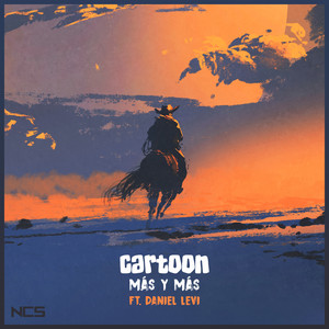
How it works
Audio Player is not nestable. Set a source, thumbnail, title and artist. Play shows when the audio is paused; Pause shows while it is playing. Timer and Duration numbers are read from the audio source automatically.
Wrapper, thumbnail, texts, play/pause, progress, timer and duration live in the Audio Player style.
Built on Howler.
Audio
Source: your audio source.
Image: the thumbnail shown on the left.
Audio Title: the track title. Default On & On.
Artist Name: the artist name. Default NCS.
Progress animation
Duration: how long the progress bar takes to catch up, not the length of the track. Default 0.4s.
GSAP easing: you can choose from a wide variety of easings. Learn more about GSAP easings here.
Audio Player
Docs
Texts

Buttons

Menus

Backgrounds

Cursors

Medias

Sliders
Cores

Animator
Texts
Buttons
Menus
Backgrounds
Cursors
Medias
Sliders
Cores
Animator
How it works
Horizontal Marquee is a nestable div component. Nested elements or components should be placed inside Content, like you would do at an Etch div or container. Nested items keep their own hover and focus states. While Content is empty, a hint is shown.
Nested items must have predefined dimensions, nowrap whitespace for text, or eager loading for images, so the marquee can calculate correctly.
Gap, rotate, blur width and blur color live in the Horizontal Marquee style.
Built on Reeller.
Style
Blur edges: if enabled, the marquee edges fade. Width and color of the fade live in the Horizontal Marquee style. Default off.
Animation
Speed: how fast the marquee runs. The higher this number is, the slower it runs. Default 3.
Loop: if enabled, the marquee loops. Default on.
Reverse: if enabled, the marquee goes from right to left instead of left to right. Default off.
Pause on Hover: if enabled, the marquee pauses on hover and continues from where it stopped. Default on.
Change speed on Hover: if enabled, the marquee speed on hover changes to Hover Speed. Default off.
Hover Speed: shown when Change speed on Hover is enabled.
GSAP easing: you can choose from a wide variety of easings. Learn more about GSAP easings here.
Custom easing: shown when GSAP easing is set to custom. Default back.out(1.7).
Scroller
If Enable scroller is on, the marquee also reacts to scroll. Shown when Enable scroller is enabled:
Enable scroller: if enabled, the marquee has scroll inertia. Default on.
Both directions: if enabled, every scroll hit alternates the marquee direction. Default off.
Speed: the inertia speed of the scroller. The higher this number is, the less inertia. Default 1.
Multiplier: how far the marquee travels on scroll. The higher this number is, the more distance. Default 0.5.
Treshold: the marquee speed applied after the first scroll. The higher this number is, the faster it runs. Default 1.
GSAP easing: you can choose from a wide variety of easings. Learn more about GSAP easings here.
Custom easing: shown when GSAP easing is set to custom. Default back.out(1.7).
Texts
Buttons
Menus
Backgrounds
Cursors
Medias
Sliders
Cores
Animator
Texts
Buttons
Menus
Backgrounds
Cursors
Medias
Sliders
Cores
Animator
Horizontal Marquee
DocsTexts
Buttons
Menus
Backgrounds
Cursors
Medias
Sliders
Cores
Animator
Texts
Buttons
Menus
Backgrounds
Cursors
Medias
Sliders
Cores
Animator
How it works
Vertical Marquee is a nestable div component. Nested elements or components should be placed inside Content, like you would do at an Etch div or container. Nested items keep their own hover and focus states. While Content is empty, a hint is shown.
Images inside Vertical Marquee should use eager loading. Height should be equal to or lower than the combined height of the nested items.
Gap and blur height live in the Vertical Marquee style.
Style
Blur edges: if enabled, the marquee edges fade. Blur height lives in the Vertical Marquee style. Default on.
Animation
Reverse: if enabled, the marquee goes from top to bottom instead of bottom to top. Default off.
Speed: how long one loop takes. Default 3s.
Pause on Hover: if enabled, the marquee pauses on hover and continues from where it stopped. Default on.
Change speed on Hover: if enabled, the marquee speed on hover changes to Hover Speed. Default off.
Hover Speed: shown when Change speed on Hover is enabled.
GSAP easing: you can choose from a wide variety of easings. Learn more about GSAP easings here.
Texts
Buttons
Menus
Backgrounds
Cursors
Medias
Sliders
Cores
Animator
Texts
Buttons
Menus
Backgrounds
Cursors
Medias
Sliders
Cores
Animator
Vertical Marquee
DocsHow it works
Smooth Scroll is not nestable. It is a hidden host that applies smooth scrolling to the page. It does not run in the canvas. Choose Lenis or GSAP ScrollSmoother.
Type: Lenis or GSAP ScrollSmoother. Default Lenis.
Disable at touch devices: if enabled, Smooth Scroll is not applied on coarse pointer devices. Default off.
Built on Lenis. Built on GSAP ScrollSmoother.
Lenis Settings
Shown when Type is Lenis.
Content at: the wrapper the smooth scroll is applied to. Default body.
Wheel multiplier: how much a wheel event moves the scroll. Default 1.
Infinite scroll: if enabled, scrolling continues from the top when reaching the end. Default off.
Smooth: how smooth the scroll is. Lives in Animation. Default 1.8.
Smooth Touch: if enabled, touch scrolling is also smoothed. Lives in Animation. Default off.
Touch multiplier: how much a touch gesture moves the scroll. Shown when Smooth Touch is on. Default 2.
Scroll Snap
Shown when Type is Lenis. Lenis is not compatible with CSS Scroll Snap. Enable this to recreate it.
Set the attribute scroll-snap-align on the elements you want to snap: start, center or end.
Enable Scroll Snap: if enabled, Lenis snaps to the targeted elements. Default off.
Snap type: mandatory or proximity. Shown when Enable Scroll Snap is on. Default mandatory.
Proximity limit: how close an element must be to snap. Shown when Snap type is proximity. Default 30%.
GSAP ScrollSmoother Settings
Shown when Type is GSAP ScrollSmoother.
Content at: the wrapper the smooth scroll is applied to. Put page content inside it. Elements using fixed position have to sit outside it, like a header or footer. Default main.
GSAP easing: you can choose from a wide variety of easings. Learn more about GSAP easings here.
Custom easing: used when GSAP easing is set to custom.
Smooth: how smooth the scroll is. Lives in Animation. Default 1.8.
Smooth Touch: if enabled, touch scrolling is also smoothed. Lives in Animation. Default off.
Smooth Touch (GSAP): the GSAP touch smoothness. Shown when Smooth Touch is on.
Parallax Items
A repeater of parallax items. Shown when Type is GSAP ScrollSmoother. Speed 0.5 scrolls at half the normal speed and Speed 2 scrolls at twice the normal speed. Lag 0.8 would take 0.8 seconds to catch up. To create inner parallax on images, put the image inside a smaller element that has overflow: hidden and set Speed to auto.
Each item:
Element class: the CSS class of the target, including the dot. Default .classname.
Speed: how fast the target scrolls relative to the page. Default 1.
Lag: how long the target takes to catch up. Default 0.
Smooth Scroll – Lenis
How it works
Smooth Scroll is not nestable. It is a hidden host that applies smooth scrolling to the page. It does not run in the canvas. Choose Lenis or GSAP ScrollSmoother.
Type: Lenis or GSAP ScrollSmoother. Default Lenis.
Disable at touch devices: if enabled, Smooth Scroll is not applied on coarse pointer devices. Default off.
Built on Lenis. Built on GSAP ScrollSmoother.
Lenis Settings
Shown when Type is Lenis.
Content at: the wrapper the smooth scroll is applied to. Default body.
Wheel multiplier: how much a wheel event moves the scroll. Default 1.
Infinite scroll: if enabled, scrolling continues from the top when reaching the end. Default off.
Smooth: how smooth the scroll is. Lives in Animation. Default 1.8.
Smooth Touch: if enabled, touch scrolling is also smoothed. Lives in Animation. Default off.
Touch multiplier: how much a touch gesture moves the scroll. Shown when Smooth Touch is on. Default 2.
Scroll Snap
Shown when Type is Lenis. Lenis is not compatible with CSS Scroll Snap. Enable this to recreate it.
Set the attribute scroll-snap-align on the elements you want to snap: start, center or end.
Enable Scroll Snap: if enabled, Lenis snaps to the targeted elements. Default off.
Snap type: mandatory or proximity. Shown when Enable Scroll Snap is on. Default mandatory.
Proximity limit: how close an element must be to snap. Shown when Snap type is proximity. Default 30%.
GSAP ScrollSmoother Settings
Shown when Type is GSAP ScrollSmoother.
Content at: the wrapper the smooth scroll is applied to. Put page content inside it. Elements using fixed position have to sit outside it, like a header or footer. Default main.
GSAP easing: you can choose from a wide variety of easings. Learn more about GSAP easings here.
Custom easing: used when GSAP easing is set to custom.
Smooth: how smooth the scroll is. Lives in Animation. Default 1.8.
Smooth Touch: if enabled, touch scrolling is also smoothed. Lives in Animation. Default off.
Smooth Touch (GSAP): the GSAP touch smoothness. Shown when Smooth Touch is on.
Parallax Items
A repeater of parallax items. Shown when Type is GSAP ScrollSmoother. Speed 0.5 scrolls at half the normal speed and Speed 2 scrolls at twice the normal speed. Lag 0.8 would take 0.8 seconds to catch up. To create inner parallax on images, put the image inside a smaller element that has overflow: hidden and set Speed to auto.
Each item:
Element class: the CSS class of the target, including the dot. Default .classname.
Speed: how fast the target scrolls relative to the page. Default 1.
Lag: how long the target takes to catch up. Default 0.
Smooth Scroll – GSAP

How it works
Glitchy applies a glitch effect to any element or component by targeting its CSS class. Add as many targets as you need in Glitchy elements. If the target has auto dimensions, the glitch may get clipped, so wrap it in a parent with some padding and apply the glitch to that parent.
Built on PowerGlitch.
Glitchy elements
A repeater of glitch targets. Add, remove and duplicate items as you need. Each item:
Element: the CSS class of the target, including the dot.
Play mode: hover, click or always. Default hover.
Animation duration: the duration of the glitch effect, in milliseconds. Default 1000.
Repeat number: how many times the glitch repeats. Default 15.
CSS Easing: the CSS easing of the glitch. Learn more about CSS easing functions here.
Glitch time start: the delay before the glitch starts, as a fraction of the duration. Default 0.4.
Glitch time end: the end of the glitch, as a fraction of the duration. Default 0.7.
Shake velocity: the speed of the glitch shake. Default 10.
X amplitude: shake amplitude on the X axis. Default 0.4.
Y amplitude: shake amplitude on the Y axis. Default 0.4.
Layers number: how many layers the animation generates. Default 4.
Steps number: layers group in steps. This is the number of those groups. Default 10.
minHeight per slice: the minimum random height a layer can take. Default 0.02.
maxHeight per slice: the maximum random height a layer can take. Default 0.40.
Final pulse: true or false. If true, a pulse clone appears after the glitch ends. Default true.
Glitchy
DocsHow it works
Expanders is a nestable div component. There is no expander repeater. Create expanders by dropping Expander components into Expander items. Set the label on the Expander. Nested elements or components should be placed inside each Expander's Content, like you would do at an Etch div or container. While Expander items is empty, a hint is shown.
Expander, label and content look live in the Expanders style. The label text and icon live on the Expander component.
Settings
Include FAQ Schema: if enabled, FAQPage schema is added to the expanders. Default off.
Open all in builder: if enabled, all expanders are open in the canvas. Default on.
Mode: click or hover. Default click.
Open one at a time: if enabled, opening one expander closes the others. Default on.
Open all by default: if enabled, all expanders open on page load. Default off.
Open this by default: the 1-based index of the expander to open on page load. Requires Open all by default to be off. Default 1.
Content animation
Duration: how long the content open/close takes. Default 0.3s.
CSS easing: the CSS easing of the content animation. Learn more about CSS easing functions here.
Icon animation
Rotation: how far the icon rotates when open. Default 180deg.
Duration: how long the icon rotation takes. Default 0.2s.
CSS easing: the CSS easing of the icon rotation. Learn more about CSS easing functions here.
Expanders
How it works
Lamp is not nestable. It is made of a wrapper and several inner parts that together make the lamp, which is absolutely positioned. The wrapper has its own dimensions; the lamp beam has its own Width, Height and Top, which should use fixed units (px, em, rem or vw/vh).
Match the Lamp background to your site background so the fade looks right: the light may overflow the wrapper. z-index should stay at -1 so that overflow does not overlay your content. Width, height, background and z-index live in the Lamp style.
Lamp
Angle: the opening degree of the light. Default 70deg.
Width: the width of the lamp beam. Default 300px.
Height: the height of the lamp beam. Default 200px.
Top: the offset of the lamp from the top of the wrapper. Default 50px.
Color: the color of the light.
Blur intensity: how much blur to apply to the light. Default 0.5.
Light intensity: how strong the light is. Default 1.
Line
Height: the height of the lamp line. Default 1.25px.
Color: the color of the lamp line.
Animation
Lamp animation uses ScrollTrigger Library to fire on scroll. Learn more about ScrollTrigger here.
Trigger: the element that will fire the animation on scroll. Use the keyword “this” to use the element itself as the trigger.
Start: determines the position of the Trigger to fire the animation. “top bottom” means when the top of the element hits the bottom of the viewport.
Duration: how long the animation takes. Default 0.75.
Delay: the delay before the animation starts. Default 0.
GSAP easing: you can choose from a wide variety of easings. Learn more about GSAP easings here.
Custom easing: used when GSAP easing is set to custom.
Toggle actions: Determines how the linked animation is controlled at the 4 distinct toggle places – onEnter, onLeave, onEnterBack, onLeaveBack, in that order. “play pause resume reset” will play the animation when entering, pause it when leaving, resume it when entering again backwards, and reset (rewind back to the beginning) when scrolling all the way back past the beginning.
Lamp
DocsHow it works
Horizontal Scroll is a nestable div component. Nested elements or components should be placed inside Content, like you would do at an Etch div or container. While Content is empty, a hint is shown.
Animations from Next Etch components inside Horizontal Scroll will be triggered automatically when scrolling through it.
You must generate a default horizontal scroll, otherwise there won’t be any content to scroll horizontally. For example, Horizontal Scroll can have 100vw as its width and a flex display and 5 children, each one having 50vw width. In this way, Horizontal Scroll would overflow horizontally, because its children would generate a 250vw width while it only has a 100vw width. Width, gap and display settings live in the Horizontal Scroll style.
Animation
Amount to scroll: determines how much scrolling amount we are giving to scroll horizontally. By default, it is set to auto, that will take the amount set by the width of the children. Setting a lower one would end the horizontal scroll before reaching the end of the children and a higher one would continue scrolling horizontally with a blank space. Default auto.
ScrollTrigger
Horizontal Scroll uses ScrollTrigger Library to pin and scroll horizontally. Learn more about ScrollTrigger here.
Scrub: determines the scrolling smoothness: how much time the animation should take to catch the user’s scroll. Default 0.1.
Start: determines the position of the Trigger to fire the animation. “center center” means when the center of the element hits the center of the viewport. Default center center.
End: determines the duration when scrolling. For example, +=900 will take 900 scrolling pixels to play the horizontal animation completely. +=1800 will take 1800 scrolling pixels, increasing the duration. Default +=1800.
Remove at breakpoint
At this section you can set the breakpoint at which Horizontal Scroll animation will be removed. If you don’t want to remove Horizontal Scroll animation at any breakpoint you can set it to 0. It is especially useful to collapse Horizontal Scroll children at mobile devices.
Breakpoint (px): the viewport width in pixels at which Horizontal Scroll animation is removed. Default 0.
Horizontal Scroll
How it works
Sync is not nestable. Set a custom logo and a custom text. The logo sits in an icon box with ripples, a trail line connects it to a badge with a spinner.
Gap, logo size, icon box, ripple, line, badge and spinner live in the Sync style.
Logo
Logo: the image shown in the icon box.
Text
Text: the label shown in the badge. Default Syncing.
Animation
Ripple Duration (s): how long each ripple expansion takes. Default 4.25.
Trail Duration (s): how long the trail takes to travel the line. Default 4.
Spinner Duration (s): how long one full spinner rotation takes. Default 2.
Sync
DocsHow it works
Timeline is a nestable div component. There is no timeline repeater. Create rows by dropping Timeline Item components into Timeline items. Each Timeline Item is a section of the timeline, with a left section, a center section and a right section. Nested elements or components should be placed inside Left Content and Right Content, like you would do at an Etch div or container. While Timeline items is empty, a hint is shown.
Left Content and Right Content should hold your content. The center section holds the circle that tracks the Timeline Item on the progress line. Content in those sections sits in a sticky wrapper, so it sticks while the item is in view. You can create as many Timeline Items as you need. If you do not need one side, leave that slot empty.
The progress line does not belong to any section. It belongs to Timeline because it is shared by all Timeline Items, so the center circle has to be positioned to match the line. Left, center and right sections already have a grid and padding. Those, the progress line, sticky top, center outline, circle look and from opacity live in the Timeline style. Match progress start and sticky top so they stay aligned. Set left and right on the progress line so it matches the center circle.
Progress
The progress line has a fixed position on the page, so that it is shared by all Timeline Items. Gradient colors and degree are set here. Path color, start, fade edges, size, left and right live in the Timeline style. It is essential to set appropriate left and right values (relative to Timeline) to match Timeline Items.
A repeater of color items for the progress line gradient. If empty, #fff, #1c6fe2 and orange are used. Each item:
Color: the color stop.
Gradient Degree: the direction of the progress line gradient. Default 180deg.
Fade Animation
All sections have a fade reveal animation. You can enable or disable the fade of each Left, Center and Right section individually.
Timeline sections uses ScrollTrigger Library to fire their fade reveal animations on scroll. Learn more about ScrollTrigger here.
Left Section Fade: if enabled, the left section fades in on scroll. Default on.
Center Section Fade: if enabled, the center section fades in on scroll. Default on.
Right Section Fade: if enabled, the right section fades in on scroll. Default on.
From opacity of the fade lives in the Timeline style. Default 0.25.
Start: determines the position of the Trigger to fire the animation. “top center” means when the top of the item hits the center of the viewport. Default top center.
End: useful when combined with Scrub. Determines when to end the animation. Default top center-=300.
GSAP easing: you can choose from a wide variety of easings. Learn more about GSAP easings here.
Custom easing: used when GSAP easing is set to custom.
Scrub: if enabled, the fade is attached to the scroll so it plays when scrolling. Default on.
Duration: requires Scrub to be off. Default 0.5.
Delay: requires Scrub to be off. Default 0.2.
toggleActions: requires Scrub to be off. Determines how the linked animation is controlled at the 4 distinct toggle places – onEnter, onLeave, onEnterBack, onLeaveBack, in that order. “play pause resume reset” will play the animation when entering, pause it when leaving, resume it when entering again backwards, and reset (rewind back to the beginning) when scrolling all the way back past the beginning. Default play none none reverse.
Timeline
How it works
QR Code lets you create a customizable QR code. Width, height and background live in the QR Code style.
Content
QR Content: the content to display when the QR Code is read. Once QR Content is set and the QR Code is generated, it will not change until a new value is given.
Enable Icon: if enabled, an icon is placed inside the QR Code. Default on.
Icon: shown when Enable Icon is enabled.
QR Style
QR Color: the color of the modules that make up the QR.
Squares Color: the color of the squares at the corners.
Squares Border Color: the color of the borders around those squares.
QR Code
DocsHow it works
Workflow is not nestable. It is made up of Workflow items. Add, remove and duplicate items as you need. Each item is a step label. The animation walks the steps with a progress ring, a checkmark and a connecting line.
Badge, progress and line live in the Workflow style.
Workflow items
A repeater of steps. Add, remove and duplicate items as you need. Each item:
Text
Animation
Progress Duration (s): how long the active step ring takes to fill. Default 1.
Line Duration (s): how long the connector line takes to fill between steps. Default 2.75.
Loop: if enabled, the animation restarts from the first step when it finishes. Default off.
Workflow
DocsHow it works
Click and Copy is a nestable div component. Nested elements or components should be placed inside Content, like you would do at an Etch div or container. It comes with an icon that switches when the copy is produced. Set Copy icon to disable if you only want your nested content. While Content is empty, a hint is shown.
Look, icon size and tooltip look live in the Click & Copy style.
Built on Tippy.
Copy
Copy type: element or text. element copies the text of a nested target. text copies Custom text. Default element.
Content element class: the CSS class of the nested target to copy from, including the dot. Leave as .classname to copy this component’s own text. Shown when Copy type is element.
Apply select on copy: if enabled, the copied text is selected when Copy type is element. Default on.
Custom text: the text to copy. Shown when Copy type is text.
Copy icon: enable or disable. If disable, the built-in icon is hidden so you can use only nested content. Default enable.
Tooltip
Enable tooltip: if enabled, a tooltip shows on hover and updates when the copy is produced. Default on.
Arrow: if enabled, the tooltip shows an arrow. Default on.
Inertia: if enabled, the tooltip animation uses inertia. Default on.
Animation type: scale, shift-away, shift-toward, perspective or fade. Default scale.
Placement: auto, top, left, bottom or right. Default auto.
Touch: if enabled, the tooltip can be triggered by touch. Default on.
Copy state text: the tooltip content before copying. Default Copy.
Copied state text: the tooltip content after copying. Default Copied!.
Click and Copy
DocsHow it works
Scrollbar is not nestable. It styles the scrollbar of a target element. The target needs overflow, otherwise there is no scrollbar to display. The component itself is hidden. It is visible on the front only.
Built on OverlayScrollbars.
Target
Selector: the CSS selector of the element whose scrollbar to style. Default body.
Overflow
Overflow Y: scroll or hidden for the vertical overflow of the target. Default scroll.
Overflow X: scroll or hidden for the horizontal overflow of the target. Default hidden.
Visibility: auto or hidden. auto shows the scrollbar when there is overflow. Default auto.
Autohide
Mode: never (always visible), scroll (shows while scrolling), leave (hides when the pointer leaves) or move (shows on scroll or pointer move). Default scroll.
Delay: how long to wait before hiding, in milliseconds. Shown when Mode is not never. Default 500.
Thumb
Color: the thumb color. Default rgba(0,0,0,0.44).
Hover color: the thumb color on hover. Default rgba(0,0,0,0.55).
Active color: the thumb color while dragging. Default rgba(0,0,0,0.66).
Border radius: the thumb border radius. Default 10px.
Track
Size: the thickness of the track. Default 6px.
Horizontal padding: the distance from the left and right of the target. Default 2px.
Vertical padding: the distance from the top and bottom of the target. Default 2px.
Border radius: the track border radius. Default 10px.
Color: the track color. Default rgba(0,0,0,0).
Hover color: the track color on hover. Default rgba(0,0,0,0).
Active color: the track color while dragging. Default rgba(0,0,0,0).
Scrollbar
Parallax Hover
Next Etch
How it works
Parallax Hover is a nestable div component. There is no wrapper repeater. Create layers by dropping Parallax Item components into Parallax items. Nested elements or components should be placed inside each Parallax Item's Content, like you would do at an Etch div or container. Offset and opacity of each layer live on the Parallax Item. While Parallax items is empty, a hint is shown.
Size and inner look live in the Parallax Hover style.
Built on Atropos.
Behavior
Always active: if enabled, the effect stays on even when the pointer is not over the component. Default off.
Offset: the translateZ of the effect when active. Default 50.
Duration: the transition duration when entering, leaving and rotating, in milliseconds. Default 300.
Rotate
Enable rotate: if enabled, the container rotates with the pointer. Default on.
Enable rotate touch: if enabled, the container also rotates on touch. Default on.
Max X: the max rotation along the X axis, in degrees. Shown when Enable rotate is on. Default 15.
Max Y: the max rotation along the Y axis, in degrees. Shown when Enable rotate is on. Default 15.
Invert X: if enabled, rotation along the X axis is inverted. Shown when Enable rotate is on. Default off.
Invert Y: if enabled, rotation along the Y axis is inverted. Shown when Enable rotate is on. Default off.
Stretch
X axis: how far to translate along the X axis, as a percentage of the width. e.g. 50 moves ±50%. Default 0.
Y axis: how far to translate along the Y axis, as a percentage of the width. Default 0.
Z axis: how far to translate along the Z axis, as a percentage of the width. Default 0.
Shadow
Enable shadow: if enabled, a shadow is generated behind the component. Default on.
Offset: the translateZ of the shadow. Shown when Enable shadow is on. Default 50.
Scale: the scale factor of the shadow. Shown when Enable shadow is on. Default 1.
Highlight: if enabled, a highlight is included in the effect. Default on.
Parallax Hover
Next Etch
Parallax Hover
Docs
How it works
Looping Tabs is a nestable div component. There is no tabs repeater. Create tabs by dropping Looping Tab components into Tab items. Nested elements or components should be placed inside each Looping Tab's Content, like you would do at an Etch div or container. The nav is generated from those tabs. Set the nav label on the Looping Tab. While Tab items is empty, a hint is shown.
Nav, nav items, progress and tab look live in the Looping Tabs style. The nav label lives on the Looping Tab component.
HTML tag
HTML tag: div, section, article, aside, header, footer, main, nav or custom. Default div.
Custom tag: shown when HTML tag is custom. Default div.
Progress Style
Mode: horizontal or vertical. Default horizontal.
Tab
Active Tab: the 1-based index of the tab that starts active. Default 1.
Progress Animation
Duration: how long each tab stays active before the next one. Default 3s.
GSAP Easing: you can choose from a wide variety of easings. Learn more about GSAP easings here.
Custom easing: shown when GSAP Easing is set to custom. Default back.out(1.7).
Nav Item Background Animation
Background Duration: how long the nav item background takes to change. Default 0.2s.
Background CSS Easing: the CSS easing of the nav item background change. Learn more about CSS easing functions here.
Looping Tabs
DocsHow it works
Decode Card is a nestable div component. Nested elements or components should be placed inside Content. They sit in a blur mask that is not affected by the Decode animation. While Content is empty, a hint is shown.
Width, height, decode letters, gradient colors, backdrop filter and content mask live in the Decode Card style.
Animation
Include Characters: if disabled, the Decode spotlight is just the gradient. Default on.
Characters: the alphabet used for the Decode letters. Shown when Include Characters is enabled.
Text Length: how much text to generate under the spotlight. Use a larger value on a larger card. Shown when Include Characters is enabled. Default 2500.
Gradient Size: the size of the Decode spotlight. Default 250.
Fade Duration: how long the spotlight takes to fade. Default 0.5s.
Fade CSS Easing: the CSS easing of the fade. Learn more about CSS easing functions here.
Decode Card
DocsHow it works
Progress Bar v2 is not nestable. It is a full-width page-scroll progress bar with a gradient. Height, z-index, top and bottom live in the Progress Bar v2 style.
Colors
A repeater of color items for the progress gradient. If empty, #A97CF8, #F38CB8 and #FDCC92 are used. Each item:
Color: the color stop.
Animation
Duration: how long the progress animation takes. Default 0.5.
GSAP easing: you can choose from a wide variety of easings. Learn more about GSAP easings here.
Custom easing: used when GSAP easing is set to custom.
Progress Bar v2
Front
Back
How it works
Flipbox is a nestable div component. Nested elements or components for the visible face should be placed inside Front Content. Nested elements or components for the flipped face should be placed inside Back Content. While a slot is empty, a hint is shown.
Width, height and Front/Back look live in the Flipbox style.
Animation
Perspective: the intensity of the 3D flip. Default 800px.
Type: horizontal, horizontal-reverse, vertical or vertical-reverse. Default horizontal.
Trigger: hover or click. Default hover.
Duration: how long the flip takes. Default 1.3s.
CSS Easing: the CSS easing of the flip. Learn more about CSS easing functions here.
Misc
Reset: if enabled, the Flipbox returns from Back to Front after Reset After. Default off.
Reset After: how long to wait before flipping back. Shown when Reset is enabled. Default 5s.
Keep open: if enabled, this Flipbox stays open when another Flipbox is clicked. Shown when Trigger is click. Default off.
Front
Back
Flipbox
DocsTippy
How it works
Tippy attaches a tooltip to any element or component by targeting its CSS class. Add as many targets as you need in Tippy elements.
Built on Tippy.
Tippy elements
A repeater of tooltip targets. Add, remove and duplicate items as you need. Each item:
Element: the CSS class of the target, including the dot.
Text: the content to display in the tooltip.
Background
Color
Font size
Font family
Font weight
Letter spacing
Padding: top, right, bottom, left, comma-separated. Default 0,4,0,4.
Border color
Border radius
Border width
Show duration: the entrance duration of the tooltip, in milliseconds. Default 250.
Hide duration: the exit duration of the tooltip, in milliseconds. Default 200.
Arrow: true or false. If true, an arrow points to the target. Default true.
Arrow color: the color of the arrow, independent from the tooltip background.
Show Delay: the entrance delay, in milliseconds. Default 50.
Hide Delay: the exit delay, in milliseconds. Default 50.
Trigger animation: mouseenter or click. Default mouseenter.
Animation: fade, scale, shift-toward, shift-away or perspective. Default scale.
Inertia: true or false. Default true.
Follow cursor: false, true (X and Y), horizontal (X), vertical (Y) or initial. Default false.
Hide on click: if true, clicking the target hides the tooltip once it is shown. Default true.
Interactive: if true, the tooltip content can be selected. Default true.
Max width: the maximum width of the tooltip. Default none.
Placement: top, left, right or bottom. Default bottom.
zIndex: the z-index of the tooltip. Default 9999.
Touch: if true, the tooltip can be triggered by touch. Default false.
Tippy
Tippy
DocsObserver
How it works
Observer is a nestable div component. Nested elements or components should be placed inside Content, like you would do at an Etch div or container. Observer tilts that content based on the pointer position over the Observe target, including pointer movement and scroll. While Content is empty, a hint is shown.
Display, size and background live in the Observer style.
Tilt
Observe: the CSS class of the element that triggers the tilt when the pointer moves over it, including the dot. Leave as .classname to use the body.
Constrain: how strong the tilt is. Lower values tilt more. Default 200.
Perspective: the 3D perspective of the tilt, in pixels. Default 100.
Observer
Observer
DocsHow it works
Toast creates notifications depending on the selected events. To create a notification, use the Toasts repeater. Each Toast can have a Title, Description and Event: pageload (after Show Time) or click (by an element's className as the Trigger). Stacked toasts expand on hover and collapse when the pointer leaves.
Position, stacking, toast look, title, description and close button live in the Toast style.
Toasts
A repeater of notifications. Add, remove and duplicate items as you need. Each item:
Title
Description
Event: pageload or click. Default pageload.
Show Time: how long to wait after page load before showing this Toast. Shown when Event is pageload. Default 5s.
Trigger: the className of the element that shows this Toast. Shown when Event is click.
Show animation
Duration: how long the Toast takes to appear. Default 0.3s.
GSAP easing: you can choose from a wide variety of easings. Learn more about GSAP easings here.
Hide animation
Duration: how long the Toast takes to disappear. Default 0.5s.
GSAP easing: you can choose from a wide variety of easings. Learn more about GSAP easings here.
Expand animation
Gap: the space between toasts when the stack expands on hover. Default 10px.
Duration: how long the expand takes. Default 1s.
GSAP easing: you can choose from a wide variety of easings. Learn more about GSAP easings here.
Collapse animation
Duration: how long the collapse takes. Default 1s.
GSAP easing: you can choose from a wide variety of easings. Learn more about GSAP easings here.
Toast
DocsHow it works
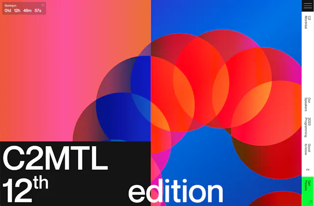
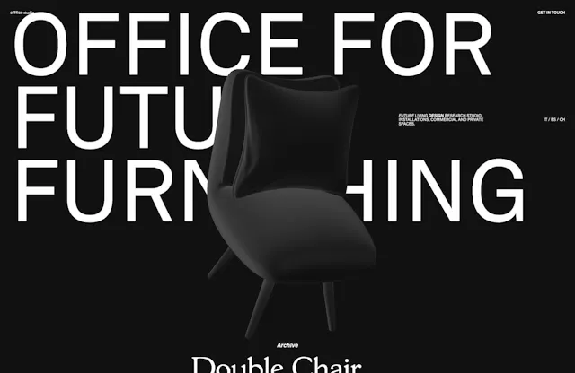
Distorsion Tabs is a nestable div component. There is no tabs repeater. Create tabs by dropping Distorsion Tab components into Tab items. Nested elements or components should be placed inside each Distorsion Tab's Content, like you would do at an Etch div or container. The nav is generated from those tabs. Set the nav label on the Distorsion Tab. The first Distorsion Tab triggers the first tab panel, the second triggers the second, and so on. While Tab items is empty, a hint is shown.
Gap, nav items and tab dimensions live in the Distorsion Tabs style. Each tab is absolutely positioned, so give the tabs defined width and height. To stack the nav above the tabs, set flex-direction to column in the Distorsion Tabs style. The nav label lives on the Distorsion Tab component.
Settings
Active Tab: the 1-based index of the tab that starts active. Default 1.
Event: hover or click. When to trigger the tabs. Default hover.
Distorsion Animation
Duration: how long the distortion switch takes. Default 1.2s.
GSAP easing: you can choose from a wide variety of easings. Learn more about GSAP easings here.
Custom easing: shown when GSAP easing is set to custom. Default back.out(1.7).
Nav Items Fade
Opacity: the opacity of inactive nav items. Default 0.3.
Opacity Duration: how long the nav fade takes. Default 0.3s.
Opacity Easing: the CSS easing of the nav fade. Learn more about CSS easing functions here.

Distorsion Tabs
DocsHow it works
Sticky Footer is a nestable div component. Nested elements or components should be placed inside Content, like you would do at an Etch div or container. While Content is empty, a hint is shown.
Place it in a footer template or at the bottom of the page. Make sure the page has enough content to scroll so the footer can be revealed at the end.
Width and background live in the Sticky Footer style.
HTML tag: div, footer, section or custom. Default div.
Custom tag: the custom HTML tag. Shown when HTML tag is custom. Default div.
Sticky Footer

How it works
Motion Divider is not nestable. It is a line that reveals on scroll. Height, color and border style live in the Motion Divider style.
Line
Type: from where the animation starts: fromLeft, fromRight or fromCenter. Default fromLeft.
Width: the width of the divider. Default 100%.
Animation
Duration: how long the reveal takes. Default 0.6.
GSAP easing: you can choose from a wide variety of easings. Learn more about GSAP easings here.
Custom easing: used when GSAP easing is set to custom.
ScrollTrigger
Motion Divider animation uses ScrollTrigger Library to fire on scroll. Learn more about ScrollTrigger here.
Trigger: the element that will fire the animation on scroll. Use the keyword “this” to use the element itself as the trigger.
Start: determines the position of the Trigger to fire the animation. “top bottom” means when the top of the element hits the bottom of the viewport.
End: the end position of the Trigger. Default unset.
Delay: the delay before the animation starts. Default 0.2.
Scrub: links the animation progress to the scrollbar. false disables scrub. Default false.
toggleActions: Determines how the linked animation is controlled at the 4 distinct toggle places – onEnter, onLeave, onEnterBack, onLeaveBack, in that order. “play pause resume reset” will play the animation when entering, pause it when leaving, resume it when entering again backwards, and reset (rewind back to the beginning) when scrolling all the way back past the beginning.
Additional Triggers
In case you need to fire the animation on additional events.
Trigger on: None, Click or Hover. Default none.
Element: the CSS class of the target that will fire the animation on the additional event selected, including the dot. Shown when Trigger on is Click or Hover.
Motion Divider
DocsInverted Corner
Next Etch
How it works
Inverted Corner is a nestable div component based on the inverted-corners look. Nested elements or components for the main area should be placed inside Content. Nested elements or components for each inverted corner should be placed inside Corner 1, Corner 2, Corner 3 or Corner 4. While a slot is empty, a hint is shown.
Width, height, block border radius, block content background and mask background live in the Inverted Corner style. Block border radius is applied to the main area except the inverted corners. Mask background is the space occupied by each inverted corner.
Corner 1
Enable: if disabled, this inverted corner is not rendered. Default on.
Position: where to place the inverted corner: top-left, top-right, bottom-left or bottom-right. Default top-left.
Width: the width occupied by the corner slot. Default 60px.
Height: the height occupied by the corner slot. Default 60px.
Border Radius: the radius of the inverted corner. Default 50%.
Distance: the margin offset of the corner. 0 applies no offset, so Width and Height determine everything. Default 6px.
Corner 2
Same controls as Corner 1. Default Position: top-right.
Corner 3
Same controls as Corner 1. Default Position: bottom-left.
Corner 4
Same controls as Corner 1. Default Position: bottom-right.
Inverted Corner
Next Etch
Inverted Corner
DocsHow it works
Stacking Cards is a nestable div component. There is no cards repeater. Create cards by dropping Stacking Card components into Card items. Nested elements or components should be placed inside each Stacking Card’s Content, like you would do at an Etch div or container. While Card items is empty, a hint is shown.
Stacking Cards will automatically take Cards height to create the stacking effect. If you want the last Card to be stacked as shown in the demo you will have to define a fixed height instead of using an auto height. The demo has a height of 7000px. Height of the wrapper lives in the Stacking Cards style. Width, height and background of each card live in the Stacking Card style.
Cards Style
You can customize Cards styles at once from the Stacking Cards style, or set any style you need on each Stacking Card. There are several customizations to create Stacking Cards variations. For example, you can define a custom width per Card instead of a shared width to create a perspective effect.
Animation
Top, the general sticky distance the cards will stick to, lives in the Stacking Cards style. Default 0px. In case you want a stacking effect you can customize top at each Stacking Card. The demo uses 25vh.
Brightness to: the brightness applied to the cards on scroll. Default 50%.
Scale to: the scale applied to the cards on scroll. Default 0.95.
Radius to: the border radius applied to the cards on scroll. Default 40.
ScrollTrigger
Stacking Cards uses ScrollTrigger Library to fire the stacking animation on scroll. Start and End are applied to each Stacking Card. Learn more about ScrollTrigger here.
Start: determines the position of the Trigger to fire the animation. “top top” means when the top of the card hits the top of the viewport. Default top top.
End: determines the end of the animation. Default +=100%.
GSAP easing: you can choose from a wide variety of easings. Learn more about GSAP easings here.
Stacking Cards
How it works
Orbit is not nestable. It is made up of Orbit items that rotate around a center Logo. Add, remove and duplicate items as you need. Each item is a logo image.
Item background, border and gradient opacity live in the Orbit style.
Logo
Logo: the image shown at the center of the orbit.
Orbit items
A repeater of orbiting logos. Add, remove and duplicate items as you need. Each item:
Logo
Rings
Ring Number: how many concentric rings are drawn. Default 8.
Style
Size: the width and height of the orbit. Default 328px.
Orbit Diameter: the diameter of the path the items follow. Default 240px.
Items Size: the size of each orbiting item. Default 48px.
First Ring Size: the diameter of the innermost ring. Default 104px.
Gap: the space between consecutive rings. Default 32px.
Path Color: the color of the static ring paths.
Gradient Color 1: the first color of the rotating ring gradient.
Gradient Color 2: the second color of the rotating ring gradient.
Gradient Color 3: the third color of the rotating ring gradient.
Animation
Gradient Speed (s): how long one full rotation of the ring gradient takes. Default 10.
Orbit Speed (s): how long one full rotation of the orbiting items takes. Default 80.

Orbit
DocsHow it works
Chart is not nestable. It is made up of Data Points. The animation follows these points to draw the path. Add, remove and duplicate items as you need.
Width lives in the Chart style.
Data Points
A repeater of values that shape the line. Each item:
Value: a number from 0 to 100. Higher values sit higher on the chart.
Style
Line Width: the stroke width of the chart line. Default 2.28.
Line Color: the color of the chart line.
Fill Color: the color of the area under the line.
Animation
Duration (s): how long the draw animation takes. Default 8.
Loop: if enabled, the animation restarts when it finishes. Default off.
Chart
DocsHow it works
Table of Contents is not nestable. It builds a list of anchors from headings in the page. Heading ids are generated when missing. Padding, sticky top, outline look, link padding, hover color, selected color, selected line and arrow color live in the Table of Contents style.
Settings
Smooth Scroll: if enabled, clicking an anchor that redirects to the same page scrolls smoothly. Default off. Learn more about CSS scroll-behavior here.
Content selector: the element from where the table of contents will get its heading selectors. Default main. If the selector does not match anything, it falls back to main, then article, then body.
Headings selector: the tag of the elements that will be included at Table of Contents. You can also set ids and class selectors, and combine them by separating with commas. e.g: h2, #my-heading, .toc-heading. Default h2, h3.
Ignore selector: if there is an element that meets the Headings selector but should not be included at Table of Contents, select it here by its tag, id or class.
Scroll Toggle: determines when the next heading will be toggled at Table of Contents when it comes into view: onEnter or onCenter. Default onCenter.
Offset: the heading’s top distance to leave when clicking an anchor at the table of contents. Default 0px.
Sticky: if enabled, Table of Contents becomes sticky. You will have to set a relative position at the parent it has to stick to. Sticky top lives in the Table of Contents style. Default off.
Outline Animation
There is an outline animation at the headings when clicking their anchor at Table of Contents. Outline width, color and style live in the Table of Contents style.
Duration: how long the heading outline animation lasts. Default 2s.
Responsive
If Enable collapse is on, Table of Contents will collapse at the breakpoint, converting into a dropdown. The dropdown will have 3 animations: arrow, dropdown and text swap. Their properties, duration and easing can be customized below.
Enable collapse: if enabled, Table of Contents collapses into a dropdown below the breakpoint. Default off.
Breakpoint (px): the viewport width in pixels at which it collapses. Shown when Enable collapse is on. Default 767.
Arrow Style
Shown when Enable collapse is on. Arrow color lives in the Table of Contents style.
Dimensions: the size of the dropdown arrow. Default 16px.
Arrow Animation
Shown when Enable collapse is on.
Rotate: how far the arrow rotates when open. Default -90deg.
Transform from: the starting offset of the arrow motion. Default 3px.
Transform intensity: how far the arrow moves. Default 8px.
Duration: how long the arrow animation takes. Default 0.3s.
CSS easing: the CSS easing of the arrow animation. Learn more about CSS easing functions here.
Dropdown Animation
Shown when Enable collapse is on.
From: the starting offset of the dropdown. Default 10px.
Duration: how long the dropdown animation takes. Default 0.4s.
CSS easing: the CSS easing of the dropdown animation. Learn more about CSS easing functions here.
Text Swap Animation
Shown when Enable collapse is on.
From: the starting offset of the text swap. Default -10px.
Duration: how long the text swap takes. Default 0.4s.
CSS easing: the CSS easing of the text swap. Learn more about CSS easing functions here.
Table of Contents
How it works
Spinner is not nestable. There are 8 types, from Type-a to Type-h. Type-a, Type-b and Type-c are line spinners. Type-d through Type-h are fill/draw spinners. Size, stroke and fill live in the Spinner style.
Type: Type-a, Type-b, Type-c, Type-d, Type-e, Type-f, Type-g or Type-h. Default Type-a.
Spinner animation uses ScrollTrigger Library to fire on scroll. Learn more about ScrollTrigger here.
Path animation (lines)
Enable: if enabled, the line strokes draw on scroll. Applies to Type-a, Type-b and Type-c. Default off.
Duration: how long the draw takes. Default 1.
Stagger: the delay between strokes. Default 0.25.
Trigger: the element that will fire the animation on scroll. Use the keyword “this” to use the element itself as the trigger.
Start: determines the position of the Trigger to fire the animation. “top bottom” means when the top of the element hits the bottom of the viewport.
Path animation (draw)
Enable: if enabled, the path draws on scroll. Applies to Type-d, Type-e, Type-f, Type-g and Type-h. Default off.
Duration: how long the draw takes. Default 1.
Trigger: the element that will fire the animation on scroll. Use the keyword “this” to use the element itself as the trigger.
Start: determines the position of the Trigger to fire the animation. “top bottom” means when the top of the element hits the bottom of the viewport.
Rotation
Duration: how long one rotation takes. Default 6.
Delay: the delay before the rotation starts. Default 1.
GSAP easing: you can choose from a wide variety of easings. Learn more about GSAP easings here.
Custom easing: used when GSAP easing is set to custom.
Spinner
DocsHow it works
Lottie is not nestable. Paste a Lottie JSON URL in Source. Width and height live in the Lottie style.
You can pick from a wide variety of Lotties at LottieFiles here.
Built on Lottie.
Source
Source: the URL of the Lottie JSON to play.
Playback
Autoplay: if enabled, the Lottie plays on page load. Default on. Disable Autoplay to use Custom trigger.
Loop: if enabled, the Lottie repeats. Default on.
Speed: the playback speed. Default 1.
Custom trigger
Custom trigger only applies when Autoplay is off.
Mode: cursor or scroll. Default cursor.
Cursor type: hover or click. Shown when Mode is cursor. Default hover.
Force flag: if enabled, the Lottie restarts on each hover or click. Shown when Mode is cursor. Default on.
Scroll type: seek (frames follow the scrollbar) or play (plays when it enters the viewport). Shown when Mode is scroll. Default seek.
Start visibility: the start of the viewport range for the scroll animation. Shown when Mode is scroll. Default 0.
End visibility: the end of the viewport range for the scroll animation. Shown when Mode is scroll. Default 1.
Start frame: the first frame of the Lottie. Shown when Mode is scroll. Default 0. Open the Lottie URL and search for ip.
End frame: the last frame of the Lottie. Shown when Mode is scroll. Default 120. Open the Lottie URL and search for op.
Lottie
DocsHow it works
Pixels Shimmer Card is a nestable div component. Nested elements or components should be placed inside Content, like you would do at an Etch div or container. While Content is empty, a hint is shown.
Width, height, background and border live in the Pixels Shimmer Card style.
Pixels Colors
A repeater of colors for the pixel sequence on hover. Add, remove and duplicate items as you need. Each item:
Color
Animation
Speed: how fast the pixels animate on hover. Default 20.
Pixels Gap: the gap between pixels. Default 3.
Border animation
Active border Color: the color of the border animation on hover.
Duration: how long the border animation takes. Default 0.8s.
CSS Easing: the CSS easing of the border animation. Learn more about CSS easing functions here.
Pixels Shimmer Card
DocsHow it works
Site Loader is not nestable. Drop it in your page. All the logic is managed behind. The Etch canvas shows the static type so you can customize it. The animation runs on the front. Look of each type lives in the Site Loader style.
If Site Loader is included in your page, animations from Next Etch components will trigger after the Site Loader ends.
Site Loader: type1 through type11. Default type1.
Min. loading time: Site Loader detects when the page is ready and shows that in the progress and counters. In most cases the loading time is extremely short, so a loader that can’t even last a second is a poor UX. This sets at least a minimum loading time. Default 4s.
Depending on the type selected, the groups below will be different. Each animation group has a GSAP easing named after the group, for example Swap Easing, and Custom easing when that easing is set to custom.
When will Site Loader display?
Site Loader will display if the user reloads the page or if they are coming from another website to yours or from the search engine. If the user is navigating through your website, the Site Loader on your page will automatically detect that they are coming already from a page that belongs to your website, so it won’t display in this case.
Type 1
Shown when Site Loader is type1.
Loading Text: the text shown while loading. Default Loading.
Complete Text: the text shown when loading is complete. Default Complete.
Swap: Duration 0.7s, Stagger 0.03s.
Slide: Duration 1s, Delay 0.4s.
Progress Bar: Progress Bar Easing.
Type 2
Shown when Site Loader is type2.
Progress Bar: Progress Bar Easing.
Percentage: Percentage Easing.
Slide: Duration 1s, Delay 0.4s.
Type 3
Shown when Site Loader is type3.
Symbol: the command prompt symbol. Default $.
Command line 1: the first command. Default Removing the boring WordPress website.
Command line 2: the second command. Default Accessing Etch Builder.
Command line 3: the third command. Default Launching Next Etch.
Command line 4: the fourth command. Default Decoding Elements.
Terminal: Finish Scale 0.95, Scale Duration 0.5s.
Commands: Translate From 20px, Duration 0.5s.
Exit Fade: Duration 0.5s.
Cursor Blink Duration: how long one blink cycle takes. Default 1s.
CSS Easing: the CSS easing of the cursor blink. Default ease-in-out. Learn more about CSS easing functions here.
Type 4
Shown when Site Loader is type4.
Progress Text: the label next to the counter. Default loading.
Initial Loading: Duration 1.5s, Delay 0.5s.
Progress: Progress Easing.
Exit Slides: Duration 1s.
Type 5
Shown when Site Loader is type5.
Brand: the brand text. Default Next Etch.
Count Exit Fade: Duration 0.5s.
Swap: Duration 1.5s, Stagger 0.03s.
Loader Scale: Scale 0.5, Duration 2s.
Exit Slides: Duration 1.5s.
Type 6
Shown when Site Loader is type6.
Counter Swap: Duration 1s, Stagger 0.1s.
Exit Type: toTop, toBottom, toLeft or toRight. Default toTop.
Exit Animation: Duration 1s.
Type 7
Shown when Site Loader is type7.
Set the logo in the Logo group. Image and Alt text.
Progress: Progress Easing.
Bar Scale: Scale 200, Duration 1s.
Exit Fade: Duration 0.5s.
Type 8
Shown when Site Loader is type8.
Bars number lives in the Site Loader style. Default 10.
Bars: Duration 0.8s, Stagger 0.03s.
Counter Exit Fade: Duration 0.5s.
Type 9
Shown when Site Loader is type9.
Direction: top or bottom. Shown in Exit. Default bottom.
Bars number lives in the Site Loader style. Default 20.
Bars: Duration 0.8s, Stagger 0.03s.
Counter Exit Fade: Duration 0.5s.
Type 10
Shown when Site Loader is type10.
Text Left: the left clip text. Default Next.
Text Right: the right clip text. Default Etch.
Progress: Progress Easing.
Progress Exit Fade: Duration 0.5s.
Slides: Duration 1s.
Type 11
Shown when Site Loader is type11.
Set the logo in the Logo group. Image and Alt Text.
From: left or top. The direction the logo fill progress comes from. Default left.
Exit Fade: Duration 0.5s.
Site Loader
How it works
Next Tabs is a nestable div component. There is no tabs repeater. Create tabs by dropping Next Tab components into Tab items. Nested elements or components should be placed inside each Next Tab's Content, like you would do at an Etch div or container. The nav is generated from those tabs. Set the nav label on the Next Tab. The first Next Tab triggers the first tab panel, the second triggers the second, and so on. While Tab items is empty, a hint is shown.
Nav, nav items and tab look live in the Next Tabs style. The nav label lives on the Next Tab component. The entrance fade from opacity lives in the Next Tabs style.
Settings
Show tab at builder: the 1-based index of the tab to preview in the canvas. Leave empty to follow Active Tab.
Active Tab: the 1-based index of the tab that starts active. Default 1.
Animation
The tab entrance uses From X and From Y together. They share Duration and CSS Easing.
From X: the starting horizontal offset of the tab entrance. Default 0px.
From Y: the starting vertical offset of the tab entrance. Default 0px.
Duration: how long the entrance takes. Default 0.4s.
CSS Easing: the CSS easing of the entrance. Learn more about CSS easing functions here.
Next Tabs
How it works
Codepen is not nestable. Paste a CodePen URL to embed it. Width lives in the Codepen style.
Settings
Codepen URL: the URL of the pen you want to display.
Default tab: HTML and Result, CSS and Result, JS and Result, HTML and CSS, HTML and JS, CSS and JS, only Result, only HTML, only CSS or only JS. Default HTML and Result.
Editable: if enabled, users can edit the pen’s code. Default off.
Preview: if enabled, a Run Pen button displays instead of running the pen on page load. Default off.
Theme ID: default, light, dark, or a theme number. e.g. 31205. Default default.
Default zoom: the default zoom of the preview: 0.25, 0.5 or 1. Default 0.5.
Height: the height of the embed. Default 300.
Codepen
DocsHow it works
Progress Bar v1 is not nestable. It is a vertical page-scroll progress with a percentage. Width, height, position, path color, fill color and number look live in the Progress Bar v1 style.
Position
Progress Bar v1 has a fixed position set. You can change it to relative or absolute in the Progress Bar v1 style. z-index, top, left, bottom and right also live there.
Progress
Path color is the color of the path filled by the progress. Fill color is the color of the progress. Both live in the Progress Bar v1 style.
Number
The progress number is absolute and relative to the progress bar. Typography, top and left live in the Progress Bar v1 style.
Progress Bar v1
How it works
Toolteam is made up of Team Members. To create a profile, use the Team Members repeater. Each Team Member can have its own Profile image, Name and Role.
Width, overlapping gaps, avatar, tooltip and name/role look live in the Toolteam style.
Team Members
A repeater of team members. Add, remove and duplicate items as you need. Each item:
Profile image
Name
Role
Tooltip animation
Fade duration: how long the tooltip takes to fade in and out. Default 0.2s.
Fade CSS easing: the CSS easing of the fade. Learn more about CSS easing functions here.
Scale from: the starting scale of the tooltip. Default 0.7.
Scale duration: how long the tooltip scale takes. Default 0.1s.
Scale CSS easing: the CSS easing of the scale. Learn more about CSS easing functions here.
Toolteam
DocsHow it works
Interactive Divider is a divider with a bouncing animation when the pointer enters it.
Style
Width: the width of the divider. Default 100%.
Height: the stroke height of the divider. Default 1px.
Color: the color of the divider line.
Animation
Drag distance: the proximity distance required to drag the divider. Default 40px.
Drop distance: once dragged, the vertical distance required to drop the divider. Default 500px.
Bend intensity: how much elasticity to apply to the divider. Default 100.
Interactive Divider
DocsGlowing Card
How it works
Glowing Card is a nestable div component. Nested elements or components should be placed inside Content, like you would do at an Etch div or container. While Content is empty, a hint is shown.
Width, height, padding and box-shadow live in the Glowing Card style.
Disable at touch devices: if enabled on a coarse pointer, the glow is turned off. Enabling it on one card also disables every other Glowing Card on the page. Default off.
Style
Glow color is determined by HSL parameters: Base, Spread, Saturation and Lightness. Learn more about HSL here.
Base: the hue of the glow. Default 80.
Spread: how far the hue shifts with the pointer. Default 500.
Saturation: the saturation of the glow. Default 100.
Lightness: the lightness of the glow. Default 50.
Outer: 1 shows the outer glow, 0 hides it. Default 1.
Size: the size of the glow. Default 200.
Blur: the backdrop blur intensity. Default 5.
Backdrop: the background of the card. Default hsl(0 0% 60% / 0.12).
Spot Alpha: the alpha of the backdrop spotlight. Default 0.1.
Radius: the border radius of the card. Default 14.
Border Width: the border width of the card. Default 3.
Border Spot Alpha: the alpha of the glowing border spot. Default 1.
Border Light Alpha: the alpha of the glowing border light. Default 1.
Glowing Card
Glowing Card
DocsHow it works
Back to Top is not nestable. It is a fixed scroll-to-top button with circular reading progress. Right, bottom, circle color, path color, progress color, track color and arrow look live in the Back to Top style.
Arrow Type: type1, type2 or type3. Default type1.
Back to Top Settings
Scroll to: the pixel to scroll to. Default 0px.
Duration: how much time needed to reach the top of the page. Default 550ms.
GSAP easing: the easing applied to the movement when going upwards. You can choose from a wide variety of easings. Learn more about GSAP easings here.
Custom easing: used when GSAP easing is set to custom.
Progress Animation
Progress speed: sets the speed of the reading progress animation. Default 10.
Progress ease: sets the reading progress CSS easing. You can set any custom CSS easing of your own. Learn more about CSS easing functions here.
Entrance Animation
Entrance distance: the pixel that will determine when to display the element. Default 50px.
Entrance speed: sets the speed of the entrance animation. Default 200ms.
Entrance ease: sets the entrance animation CSS easing. You can set any custom CSS easing of your own. Learn more about CSS easing functions here.
Back to Top
How it works
Sharer is a nestable div component. Nested elements or components should be placed inside Content, like you would do at an Etch div or container. While Content is empty, a hint is shown.
Cursor and size live in the Sharer style.
Built on Sharer.
Share
Type: the social network to share to: twitter, facebook, whatsapp, linkedin, telegram, reddit, skype or viber. Default twitter.
Title to share: the title included in the share. Default Just a text to share.
Url to share: the URL included in the share. Default https://nextetch.io.
Twitter hashtags: comma-separated hashtags for Twitter. Shown when Type is twitter. Default awesome,nextetch.
Twitter username: the Twitter username to credit. Shown when Type is twitter. Default nextetch.
Facebook hashtag: the Facebook hashtag. Shown when Type is facebook. Default nextetch.
Popup
Open as a tab: if enabled, the share opens in a new tab instead of a popup. Default off.
Pop up width: the width of the share popup. Shown when Open as a tab is off. Default 500px.
Pop up height: the height of the share popup. Shown when Open as a tab is off. Default 500px.
Sharer
Docs